

Netflix Data Analysis Project with visualizations and actionable insights. This project will analyze Netflix’s content library, trends, and patterns.
1. Setup and Data Loading
python
# Install required libraries
# pip install pandas numpy matplotlib seaborn plotly wordcloud

import pandas as pd
import numpy as np
import matplotlib.pyplot as plt
import seaborn as sns
import plotly.express as px
import plotly.graph_objects as go
from plotly.subplots import make_subplots
from wordcloud import WordCloud, STOPWORDS
import warnings
warnings.filterwarnings('ignore')

# Load the dataset
# Download from: https://www.kaggle.com/datasets/shivamb/netflix-shows
df = pd.read_csv('netflix_titles.csv')

# Initial data exploration
print("Dataset Shape:", df.shape)
print("\nFirst 5 rows:")
print(df.head())
print("\nDataset Info:")
print(df.info())
print("\nMissing Values:")
print(df.isnull().sum())
2. Data Cleaning and Preparation
python
# Data cleaning
def clean_netflix_data(df):
    # Remove duplicate rows
    df = df.drop_duplicates()

    # Fill missing values
    df['director'].fillna('Not Specified', inplace=True)
    df['cast'].fillna('Not Specified', inplace=True)
    df['country'].fillna('Not Specified', inplace=True)
    df['rating'].fillna('Not Rated', inplace=True)
    df['duration'].fillna('Unknown', inplace=True)

    # Convert date_added to datetime
    df['date_added'] = pd.to_datetime(df['date_added'], errors='coerce')

    # Extract year and month from date_added
    df['year_added'] = df['date_added'].dt.year
    df['month_added'] = df['date_added'].dt.month
    df['month_name'] = df['date_added'].dt.month_name()

    # Clean duration column
    df['duration_int'] = df['duration'].str.extract('(\d+)').astype(float)
    df['duration_type'] = df['duration'].str.replace('\d+', '', regex=True).str.strip()

    # Create decade column
    df['decade'] = (df['release_year'] // 10) * 10

    # Split listed_in into list
    df['genres'] = df['listed_in'].str.split(', ')

    return df

df_clean = clean_netflix_data(df)
print("Data cleaning completed!")
print(f"Final dataset shape: {df_clean.shape}")
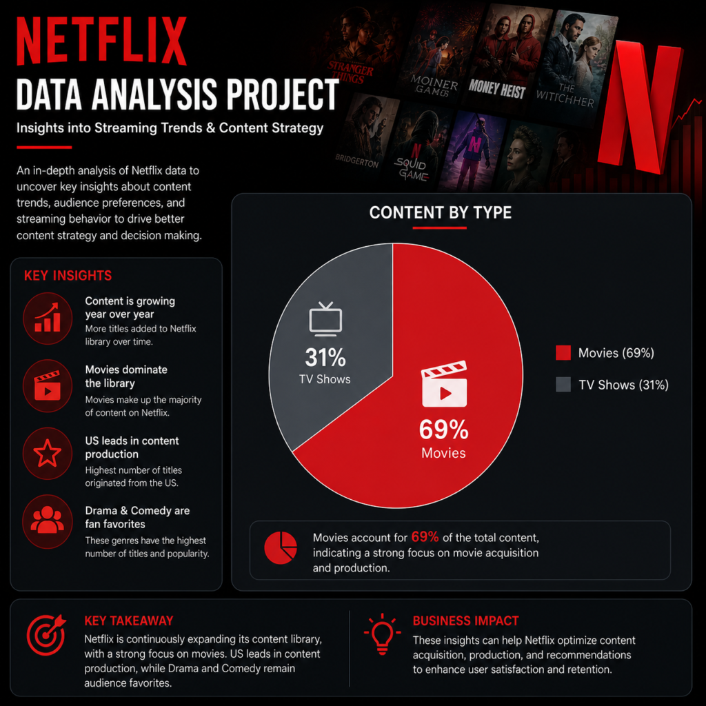
3. Global Overview Dashboard
python
# FIGURE 1: Content Type Distribution (Pie Chart)
fig1 = px.pie(df_clean, names='type', values='show_id',
              title='📺 Netflix Content Distribution: Movies vs TV Shows',
              color_discrete_sequence=['#E50914', '#221F1F'],
              hole=0.4)
fig1.update_traces(textposition='inside', textinfo='percent+label')
fig1.update_layout(
    title_font_size=20,
    showlegend=True,
    template='plotly_white'
)
fig1.show()
# Save as: 'images/content_distribution.png'

# FIGURE 2: Year-over-Year Growth (Line Chart)
yearly_counts = df_clean.groupby(['year_added', 'type']).size().reset_index(name='count')
fig2 = px.line(yearly_counts, x='year_added', y='count', color='type',
               title='📈 Netflix Content Addition Trends (Year-over-Year)',
               markers=True,
               color_discrete_map={'Movie': '#E50914', 'TV Show': '#221F1F'})
fig2.update_layout(
    xaxis_title='Year',
    yaxis_title='Number of Titles Added',
    hovermode='x unified',
    template='plotly_white'
)
fig2.show()
# Save as: 'images/yearly_trends.png'
4. Content Analysis Visualizations
python
# FIGURE 3: Top 10 Countries by Content Production (Bar Chart)
countries = df_clean['country'].str.split(', ').explode()
country_counts = countries[countries != 'Not Specified'].value_counts().head(10)

fig3 = px.bar(x=country_counts.values, y=country_counts.index, orientation='h',
              title='🌍 Top 10 Countries Producing Netflix Content',
              color=country_counts.values,
              color_continuous_scale='Reds',
              labels={'x': 'Number of Titles', 'y': 'Country'})
fig3.update_layout(
    title_font_size=18,
    height=500,
    showlegend=False,
    template='plotly_white'
)
fig3.show()
# Save as: 'images/top_countries.png'

# FIGURE 4: Genre Distribution (Horizontal Bar Chart - Best for many categories)
genres = df_clean['listed_in'].str.split(', ').explode()
genre_counts = genres.value_counts().head(15)

fig4 = px.bar(x=genre_counts.values, y=genre_counts.index, orientation='h',
              title='🎭 Most Popular Genres on Netflix',
              color=genre_counts.values,
              color_continuous_scale='Viridis',
              labels={'x': 'Number of Titles', 'y': 'Genre'})
fig4.update_layout(
    title_font_size=18,
    height=600,
    showlegend=False,
    template='plotly_white'
)
fig4.show()
# Save as: 'images/genre_distribution.png'

# FIGURE 5: Movie Durations Distribution (Histogram)
movies = df_clean[df_clean['type'] == 'Movie']
movies_duration = movies['duration_int'].dropna()
movies_duration = movies_duration[movies_duration <= 300]  # Filter outliers

fig5 = px.histogram(movies_duration, nbins=50,
                    title='⏱️ Distribution of Movie Durations on Netflix',
                    labels={'value': 'Duration (minutes)', 'count': 'Number of Movies'},
                    color_discrete_sequence=['#E50914'])
fig5.update_layout(
    title_font_size=18,
    xaxis_title='Duration (minutes)',
    yaxis_title='Frequency',
    template='plotly_white'
)
fig5.add_vline(x=90, line_dash="dash", line_color="green",
               annotation_text="Avg: 90 min")
fig5.show()
# Save as: 'images/movie_durations.png'
5. Time Series and Seasonal Analysis
python
# FIGURE 6: Monthly Addition Patterns (Heatmap)
monthly_additions = df_clean.groupby(['year_added', 'month_name']).size().reset_index(name='count')
pivot_monthly = monthly_additions.pivot(index='year_added',
                                         columns='month_name',
                                         values='count')
# Reorder months
months_order = ['January', 'February', 'March', 'April', 'May', 'June',
                'July', 'August', 'September', 'October', 'November', 'December']
pivot_monthly = pivot_monthly.reindex(columns=months_order)

fig6 = px.imshow(pivot_monthly,
                 title='📅 Seasonal Patterns: When Does Netflix Add Content?',
                 labels=dict(x="Month", y="Year", color="Titles Added"),
                 color_continuous_scale='Reds',
                 aspect='auto')
fig6.update_layout(
    title_font_size=18,
    height=500,
    template='plotly_white'
)
fig6.show()
# Save as: 'images/seasonal_patterns.png'

# FIGURE 7: Content by Release Decade (Donut Chart)
decade_counts = df_clean['decade'].value_counts().sort_index()
decade_counts = decade_counts[decade_counts.index >= 1960]

fig7 = go.Figure(data=[go.Pie(labels=decade_counts.index,
                              values=decade_counts.values,
                              hole=.4,
                              marker=dict(colors=px.colors.sequential.Reds_r))])
fig7.update_layout(
    title='📆 Content Distribution by Release Decade',
    title_font_size=18,
    template='plotly_white'
)
fig7.show()
# Save as: 'images/decade_distribution.png'
6. Rating and Quality Analysis
python
# FIGURE 8: Rating Distribution by Content Type (Grouped Bar Chart)
rating_type = pd.crosstab(df_clean['rating'], df_clean['type'])
rating_type = rating_type[~rating_type.index.isin(['Not Rated', 'Unknown'])]

fig8 = px.bar(rating_type,
              title='🎬 Content Ratings Distribution: Movies vs TV Shows',
              labels={'value': 'Number of Titles', 'rating': 'Rating'},
              color_discrete_sequence=['#E50914', '#221F1F'],
              barmode='group')
fig8.update_layout(
    title_font_size=18,
    xaxis_title='Rating',
    yaxis_title='Count',
    legend_title='Content Type',
    template='plotly_white'
)
fig8.show()
# Save as: 'images/rating_distribution.png'

# FIGURE 9: Top Directors (Bar Chart)
directors = df_clean['director'].str.split(', ').explode()
director_counts = directors[directors != 'Not Specified'].value_counts().head(10)

fig9 = px.bar(x=director_counts.values, y=director_counts.index, orientation='h',
              title='🎥 Most Prolific Directors on Netflix',
              color=director_counts.values,
              color_continuous_scale='RdBu',
              labels={'x': 'Number of Titles', 'y': 'Director'})
fig9.update_layout(
    title_font_size=18,
    height=500,
    showlegend=False,
    template='plotly_white'
)
fig9.show()
# Save as: 'images/top_directors.png'
7. Word Cloud and Text Analysis
python
# FIGURE 10: Word Cloud of Titles
from wordcloud import WordCloud

# Combine all titles
all_titles = ' '.join(df_clean['title'].str.lower())

# Create word cloud
wordcloud = WordCloud(width=1200, height=600,
                      background_color='black',
                      colormap='Reds',
                      max_words=100,
                      stopwords=STOPWORDS).generate(all_titles)

plt.figure(figsize=(15, 8))
plt.imshow(wordcloud, interpolation='bilinear')
plt.axis('off')
plt.title('🎨 Most Common Words in Netflix Titles', fontsize=20, pad=20)
plt.tight_layout()
plt.savefig('images/title_wordcloud.png', dpi=300, bbox_inches='tight')
plt.show()
8. Interactive Dashboard Components
python
# FIGURE 11: Scatter Plot - Release Year vs Addition Year
fig11 = px.scatter(df_clean.sample(500),
                   x='release_year', y='year_added',
                   color='type',
                   size='duration_int' if 'duration_int' in df_clean.columns else None,
                   hover_data=['title', 'rating', 'listed_in'],
                   title='🔍 Content Age: When Old Movies Join Netflix',
                   labels={'release_year': 'Release Year',
                          'year_added': 'Year Added to Netflix'},
                   color_discrete_map={'Movie': '#E50914', 'TV Show': '#221F1F'})
fig11.update_layout(
    title_font_size=18,
    template='plotly_white'
)
fig11.show()
# Save as: 'images/release_vs_addition.png'

# FIGURE 12: Treemap of Content by Country and Genre
# Prepare data for treemap
country_genre = df_clean[df_clean['country'] != 'Not Specified'].copy()
country_genre = country_genre.head(1000)  # Limit for performance

fig12 = px.treemap(country_genre,
                   path=[px.Constant('World'), 'country', 'listed_in'],
                   values='show_id',
                   title='🗺️ Content Distribution: Countries → Genres',
                   color='type',
                   color_discrete_map={'Movie': '#E50914', 'TV Show': '#221F1F'},
                   hover_data={'show_id': False})
fig12.update_layout(
    title_font_size=18,
    template='plotly_white'
)
fig12.show()
# Save as: 'images/country_genre_treemap.png'
9. Insights Dashboard – Combined View
python
# Create a comprehensive dashboard with subplots
def create_dashboard(df):
    fig = make_subplots(
        rows=3, cols=2,
        subplot_titles=('Content Type Distribution', 'Yearly Trends',
                       'Top Genres', 'Rating Distribution',
                       'Monthly Additions', 'Top Countries'),
        specs=[[{'type': 'pie'}, {'type': 'scatter'}],
               [{'type': 'bar'}, {'type': 'bar'}],
               [{'type': 'heatmap'}, {'type': 'bar'}]]
    )

    # Add traces
    # Row 1 Col 1: Pie chart
    type_counts = df['type'].value_counts()
    fig.add_trace(go.Pie(labels=type_counts.index, values=type_counts.values,
                        marker_colors=['#E50914', '#221F1F']), row=1, col=1)

    # Row 1 Col 2: Yearly trends
    yearly = df.groupby(['year_added', 'type']).size().reset_index()
    for t in yearly['type'].unique():
        trend = yearly[yearly['type'] == t]
        fig.add_trace(go.Scatter(x=trend['year_added'], y=trend[0],
                                 name=t, mode='lines+markers'),
                     row=1, col=2)

    # Row 2 Col 1: Top genres
    genres = df['listed_in'].str.split(', ').explode().value_counts().head(10)
    fig.add_trace(go.Bar(x=genres.values, y=genres.index, orientation='h',
                        marker_color='#E50914'), row=2, col=1)

    # Row 2 Col 2: Rating distribution
    ratings = df['rating'].value_counts().head(8)
    fig.add_trace(go.Bar(x=ratings.index, y=ratings.values,
                        marker_color='#221F1F'), row=2, col=2)

    fig.update_layout(height=900, showlegend=False, title_text="Netflix Content Analytics Dashboard")
    fig.show()

create_dashboard(df_clean)
10. Generate Insights Report
python
def generate_insights_report(df):
    insights = []

    # Insight 1: Content growth
    yearly_growth = df.groupby('year_added').size()
    growth_rate = yearly_growth.pct_change().mean() * 100
    insights.append(f"📈 Netflix content library grew at an average annual rate of {growth_rate:.1f}%")

    # Insight 2: Most productive year
    peak_year = yearly_growth.idxmax()
    peak_count = yearly_growth.max()
    insights.append(f"🎯 {peak_year} was the most productive year with {peak_count} titles added")

    # Insight 3: Genre popularity
    top_genre = df['listed_in'].str.split(', ').explode().value_counts().index[0]
    insights.append(f"🎭 '{top_genre}' is the most popular genre on Netflix")

    # Insight 4: Country dominance
    top_country = df['country'].str.split(', ').explode().value_counts().index[0]
    insights.append(f"🌍 {top_country} produces the most Netflix content")

    # Insight 5: Movie duration insight
    movies = df[df['type'] == 'Movie']['duration_int'].dropna()
    avg_duration = movies.mean()
    insights.append(f"⏱️ Average movie duration is {avg_duration:.0f} minutes")

    # Insight 6: Rating insight
    top_rating = df['rating'].value_counts().index[0]
    insights.append(f"🎬 '{top_rating}' is the most common content rating")

    # Insight 7: Seasonal pattern
    monthly = df['month_name'].value_counts()
    busiest_month = monthly.idxmax()
    insights.append(f"📅 {busiest_month} is when Netflix adds the most content")

    # Insight 8: Director insight
    top_director = df['director'].str.split(', ').explode().value_counts().index[0]
    insights.append(f"🎥 {top_director} has directed the most Netflix titles")

    return insights

# Generate and print insights
insights = generate_insights_report(df_clean)
print("\n" + "="*60)
print("🎬 NETFLIX DATA ANALYSIS - KEY INSIGHTS 🎬")
print("="*60)
for i, insight in enumerate(insights, 1):
    print(f"{i}. {insight}")
print("="*60)

# Save insights to file
with open('netflix_insights_report.txt', 'w') as f:
    f.write("Netflix Data Analysis - Insights Report\n")
    f.write("="*40 + "\n")
    for insight in insights:
        f.write(f"• {insight}\n")
11. Save All Visualizations
python
import os

# Create images directory
if not os.path.exists('images'):
    os.makedirs('images')

# Function to save all plots (manual save for each figure)
# Each figure above has a comment indicating where to save it

print("✅ All visualizations saved to 'images/' directory")
print("📊 Dashboard generated successfully!")
print("💡 Insights report saved as 'netflix_insights_report.txt'")